Schnoodler
Ice Cream Abuser
- Joined
- Nov 12, 2008
- Messages
- 6,994
- Reaction score
- 2
- Points
- 36
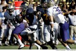
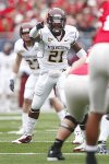
Hate the white on white, and the banana look. like the newer uni's in general but we are the maroon and gold, not the white and white, or the gold and gold.

/anyone else notice that most of the people that hate the new uniforms hate Brewster as well.....just sayin....

I'm so sick of the current jerseys. The maroon is way too purple for my liking. And the jankity piping on the bottom of the pants - what the f*ck is that?!?! We're just playing follow the follower with these BS trendy Nike jerseys.
anyone else notice that most of the people that hate the new uniforms hate Brewster as well.....just sayin....
Your opinion does not make it fact.
anyone else notice that most of the people that hate the new uniforms hate Brewster as well.....just sayin....
Three years on the joke is over. Ha-ha. Hilarious prank.
Can we have our home uniforms back now? It's not remotely funny any more.
Brewster could win the Rose Bowl and I would never forgive him for this.
Don't even try disagreeing with me. Not in the mood.

One day Studwell will come in here and make a valid post, and the whole internet will crash, Matrix-esque
Not sure how you think that? I'm a Brewster backer, but the "newer" uni's suck. White on White? Really? We look faster?
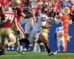
I love the programs with a distinctive look that immediately identifies who they are. That being said, we simply have not had a consistent look for the past fifty years. The uniforms under Mason from 1999 to 2006 were great. I loved the look, especially with the black shoes and socks. However, I was not against the change, nor do I think the new uniforms are bad. In fact, I think that absent a classic look, having fun with uniforms and color combinations is the way to go (a la Oregon).
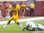
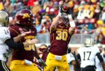
Which brings me to my one criticism.....variability. The press conference introducing the new duds showed six different combos. With the emergence of the gold jerseys this year, we have nine different possibilities. Frankly, I'd like to see all of them. I was hopeful after the first two home games when I saw gold tops/gold pants and gold tops/maroon bottoms. But that was it. It's not that I don't like the all white look, but I'd love to see us mix it up. I'd love to see every uniform combination we have. Why not have fun with it?
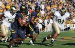
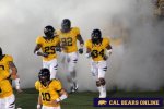
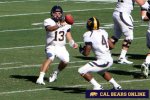
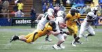
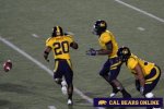
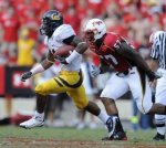
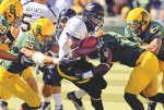
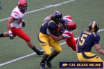
Cal does it pretty well. They have a very similar approach with three primary colors and the darkest as the helmet color. Yet they seem to use all of them, as indicated in the attachments (this gives a flavor of their options...they have used all nine combos in the last two years). I even like how they mix up the shoe colors, going with black when they wear the navy pants.
Just my two cents.
I love the programs with a distinctive look that immediately identifies who they are. That being said, we simply have not had a consistent look for the past fifty years. The uniforms under Mason from 1999 to 2006 were great. I loved the look, especially with the black shoes and socks. However, I was not against the change, nor do I think the new uniforms are bad. In fact, I think that absent a classic look, having fun with uniforms and color combinations is the way to go (a la Oregon).
Which brings me to my one criticism.....variability. The press conference introducing the new duds showed six different combos. With the emergence of the gold jerseys this year, we have nine different possibilities. Frankly, I'd like to see all of them. I was hopeful after the first two home games when I saw gold tops/gold pants and gold tops/maroon bottoms. But that was it. It's not that I don't like the all white look, but I'd love to see us mix it up. I'd love to see every uniform combination we have. Why not have fun with it?
Cal does it pretty well. They have a very similar approach with three primary colors and the darkest as the helmet color. Yet they seem to use all of them, as indicated in the attachments (this gives a flavor of their options...they have used all nine combos in the last two years). I even like how they mix up the shoe colors, going with black when they wear the navy pants.
Just my two cents.
This is about as much fun as my wife asking me what color curtains I'd like better in the spare bedroom. Who cares?
Penn State football has the best uniform in sports. They just need to get rid of the fancy stripe on the helmet and those unnecessary numbers on the shoulders.
For those of us, I am sure a terrible minority, who only get the Gophers on Radio and info from GH; would it be possible to see some pictures of the various types of uniforms.
Easier to form an opinion of what is good...and saves it for posterity, like the thread at the start of the football season.
Thanks...name is in the moniker in case I get pulled up.