Schnauzer
Pretty Sure You are Wrong
- Joined
- Jun 4, 2009
- Messages
- 6,362
- Reaction score
- 2,935
- Points
- 113
The biggest thread I recall ever on GH was a uniform thread. It even surpassed the “oops wrong topic” thread.
Anyway, wondering if there are any new tweaks or helmet combos coming up for this season? The White helmets seem to be left in 2018.
Editorial/taste comments:
I liked the old Mason era uniforms. The last simple uniforms where one knew what to expect every week. Black shoes/socks complimented it well. But they were a little more “red” than I prefer.
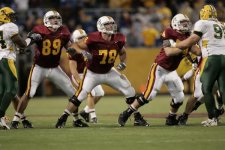
The Brewster era uniforms were worn 2008-2011 and they introduced jersey/pants in three colors that could be mixed/matched. They were my least favorite in recent history. I’m not a fan of the piping or putting the team name on the front of the jersey. I was fine with white shoes.
The Kill era uniforms (worn 2012-2017) were my favorite overall. Back to black shoes. The anthracite was a better shade of gray than the current example. Helmets were “okay”. The font on the bold numbers was really nice and I loved the bold numbers, not trimmed with a third color.
That leaves the Fleck era uniforms (2018-present) as my second favorite Gopher football uniform in recent history. Love the helmet combos. Fine with the swing back to white shoes. My problem is with the white numbers (No likey) and the lighter gray anthracite edition, that looks like color was lost in the wash. With 2022 being the 5th season with these uniforms and this “look”, is something new on the horizon?
For me, talking strictly uniforms, my ranking recap:
1. Kill
2. Fleck
3. Mason
4. Brewster
And special note: if you are one of those guys that feels a need to say “I don’t care if they wear rags, as long as they finally beat Iowa” or something similar to that, please, just move on without comment. You saw the thread title, you are here. You cared. Admit it.
Anyway, wondering if there are any new tweaks or helmet combos coming up for this season? The White helmets seem to be left in 2018.
Editorial/taste comments:
I liked the old Mason era uniforms. The last simple uniforms where one knew what to expect every week. Black shoes/socks complimented it well. But they were a little more “red” than I prefer.
The Brewster era uniforms were worn 2008-2011 and they introduced jersey/pants in three colors that could be mixed/matched. They were my least favorite in recent history. I’m not a fan of the piping or putting the team name on the front of the jersey. I was fine with white shoes.
The Kill era uniforms (worn 2012-2017) were my favorite overall. Back to black shoes. The anthracite was a better shade of gray than the current example. Helmets were “okay”. The font on the bold numbers was really nice and I loved the bold numbers, not trimmed with a third color.
That leaves the Fleck era uniforms (2018-present) as my second favorite Gopher football uniform in recent history. Love the helmet combos. Fine with the swing back to white shoes. My problem is with the white numbers (No likey) and the lighter gray anthracite edition, that looks like color was lost in the wash. With 2022 being the 5th season with these uniforms and this “look”, is something new on the horizon?
For me, talking strictly uniforms, my ranking recap:
1. Kill
2. Fleck
3. Mason
4. Brewster
And special note: if you are one of those guys that feels a need to say “I don’t care if they wear rags, as long as they finally beat Iowa” or something similar to that, please, just move on without comment. You saw the thread title, you are here. You cared. Admit it.


.jpeg")


.jpg")