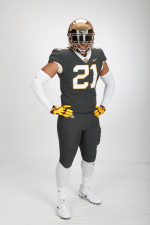
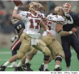
6 years later, are we still pleased with the uniform redesign?

The white collars on the maroon jerseys is a ridiculous look. The maroon also looks more eggplant, at least on TV. The color could be warmed up a bit. I like that unis aren't otherwise busy, like the Brewster era jerseys and pants.
Lights and camera color gamut can both affect how colors look on TV. When I watch the Vikings their jerseys look like NY Giants blue.


I think our current uniforms are some of the nicest in the country but I could do without the black uniform. I especially like the chrome gold helmets,really adds some pop!
 

The white tops are excellent. The maroon tops are terrible because there’s too much white and not enough gold/yellow. Would like to see gold/ yellow jerseys more with maroon numbers and white trim.


giphy.gif


I do like what Kill did with the uniforms after he got here and I like where Fleck has taken things. The uniform combinations don't bother me at all.

Throughout the years, the only part of a uniform that I disliked were these jerseys...

1705333769420.png
I also like our current "M" design as compared to the previous one you see on this helmet.
 
Last edited:

Dang.....I really like the jumbo block M. But then again.....I think the Gophers have had the best selection of helmets in college football over the past three or four years.
Agreed. The pidly little M during the Mason years was pathetic.

I'll take a helmet-sized M any day.


I do like what Kill did with the uniforms after he got here and I like where Fleck has taken things. The uniform combinations don't bother me at all.

Throughout the years, the only part of a uniform that I disliked were these jerseys...

View attachment 29562
I also like our current "M" design as compared to the previous one you see on this helmet.
The helmet M here looks like a mistake. It's not the correct logo at all.
 

I like the numbers from the Kill era.

And I like maroon and gold.

Apart from that I have no opinions, except that it's effeminate for men to obsess over clothing. :ROFLMAO:
 

I do like what Kill did with the uniforms after he got here and I like where Fleck has taken things. The uniform combinations don't bother me at all.

Throughout the years, the only part of a uniform that I disliked were these jerseys...

View attachment 29562
I also like our current "M" design as compared to the previous one you see on this helmet.
A year or two ago I saw a dude with that jersey at games.


That's a mistake. If you insist on wearing a jersey to games, it needs to be a current jersey. That way the coach can put you in if more than a handful of guys get hurt.
And this year there was a pretty good chance you could go in at linebacker.
 

I like our current uniforms. In the four past cycles I would rank them as the following:
1) Kill
2) Fleck


3) Mason
4) Brewster

I think Kill era and Fleck era are far ahead the Mason and Brewster eras. I didn't mind the Brewster era, I am a fan of a more simplistic uniform without the piping. The Fleck era uniforms have just enough jazz to them to make them a little flashy but are still overall pretty simplistic. I do love how he plays with the helmet decals.


Kill era were the best. Classic, throwback style like Penn State or Michigan.

Not a fan of the Fleck unis, overall. The 2017 era oar helmet is scarred into my visual cortex. I don’t like the last 20 years of Vikings uniforms either.

I guess I’m a codger.
 
Last edited:

I do like what Kill did with the uniforms after he got here and I like where Fleck has taken things. The uniform combinations don't bother me at all.

Throughout the years, the only part of a uniform that I disliked were these jerseys...

View attachment 29562
I also like our current "M" design as compared to the previous one you see on this helmet.

My brother in Christ, I forgot these existed. Honestly, I'd love to see these rolled out again just for the hell of it.
 

Apart from that I have no opinions, except that it's effeminate for men to obsess over clothing.

This is college football. It's the most petty and beautiful sport on the planet. We obsess over the most absurd and pointless things. We (yes, you too) are literally on a forum talking about a game played by kids. We hate Wisconsin and Iowa. It's in our veins to be petty and ridiculous. Many of us consider it a good use of our time to watch obscure high school highlights of a 17 year old recruit.

I'd consider it big, breaking news if the Gophers unveiled a uniform redesign on a wet, cloudy day in mid-March. There are no limits to my fandom. I'll buy the next NCAA football game this year and you bet your sweet ass I'm taking the gophers to the promised land in Dynasty mode.
 

according to my stats, the M-G-M combo has been worn 3 times in the Fleck era - which covers 84 games.

the team is named the Golden Gophers, but whoever makes the uniform decisions does not seem to like gold for some reason.

since I have the stats - here they are (out of 84 games)

Helmet:
Maroon - 41
Chrome - 19
Gold - 12
White - 10
Black - 2

Jersey:
White - 37
Maroon - 34
Black - 5
Gold - 4
Anthracite - 4

Pants:
Maroon - 46
Gold - 16
White - 12
Black - 5
Anthracite - 5

the Gophers have won 25 different combinations in 84 games. the most common:
All Maroon - 16
Chrome-White-Maroon - 9
Maroon-White-Maroon - 8
Chrome-Maroon-Maroon - 6
Maroon-Maroon-Gold - 5
Gold-White-Gold - 5
All White - 5

The number of chrome helmet games is far, far too high.
 

I'd like the gold to be toned down. Looks like Madam Ruth's gold cap tooth. Make it duller. - a little toward tan.


The helmet M here looks like a mistake. It's not the correct logo at all.
Ya, it seems like football did what they wanted back then...you can even go back and look at a Tony Dungy photo and its the same M. There was a lot of inconsistency in how the M logo was used. It wasn't until around 1996 that the U put an end to that; and like any good organization should, came up with standards, which includes the M that we see today on everything that is the U of M...from signage, apparel, uniforms, literature, etc.
 

I'm always a bit surprised to see folks liked the Kill era uniforms.

That maroon looked like "dirty maroon" a great deal. Maybe it was the right color but the material used or something was just off, sometimes really off ...


I'm always a bit surprised to see folks liked the Kill era uniforms.

That maroon looked like "dirty maroon" a great deal. Maybe it was the right color but the material used or something was just off, sometimes really off ...

I think people liked them because they were the closest things we've had to Mason-era standard Maroon and Golds.
 

I do like what Kill did with the uniforms after he got here and I like where Fleck has taken things. The uniform combinations don't bother me at all.

Throughout the years, the only part of a uniform that I disliked were these jerseys...

View attachment 29562
I also like our current "M" design as compared to the previous one you see on this helmet.
There wasn't a single solitary thing that was good about that uniform. I mean, where to start?

  • The use of gold/khaki instead of yellow, which is our school color. Not sure where the hell this ever came from
  • The EKG monitor pattern across the chest with the unfortunate flatline (which happened often during the Wacker years) across the back
  • The vertical M on the helmet, when our logo is more horizontally stretched
  • The black outlines around the numbers
I've never hated a uniform more than that one. While I have a few small quibbles with our current ones, they're light years better than these abominations.
 

Kill era were the best. Classic, throwback style like Penn State or Michigan.

Not a fan of the Fleck unis, overall. The 2017 era oar helmet is scarred into my visual cortex. I don’t like the last 20 years of Vikings uniforms either.

I guess I’m a codger.
Yeah, I also fell those Kill era unis were the best I have seen. As for the vikes, I do like these most recent ones, closet to the original ones, yet updated. Wish they would go with the white/white on the road more often. Did it for that home game this year, but usually go with white/purple on the road.
 

All the people downvoting the awesome anthracite uni's - I know, those banana yellow gloves don't match. They should have chrome-look gloves to match the helmets.

Go Anthracite!
It seemed too light for that color.
 

All the people downvoting the awesome anthracite uni's - I know, those banana yellow gloves don't match. They should have chrome-look gloves to match the helmets.

Go Anthracite!
Are we the "Coalden Gophers?"


Top Bottom