New floor design at The Barn

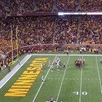
The colors on the right are the true paint job.

But if the more reddish color is how it looks in the lights to people sitting in the stands and watching in TV, then I don’t agree the complaint can be dismissed.

They should’ve gone with darker paint, so that it would appear to be the correct shade in the lights. It appears to be a mistake, in my opinion.

Doubt that either the school or the company that did the job is going to pony up for a complete redo. Just have to live with it for a number of years.
 

I cant believe were on page 3 of this thread arguing the shade of maroon. The floor is fine. It looks good. Could be worse, it could look like tcu's floor. Let's win some games.


Screen-Shot-2018-08-06-at-4.43.20-PM.jpg


I can definitely see what others are saying here, about the mismatch between the seating and the floor maroon colors. Compared to the maroon on this forum, which I believe is the technically correct digital color code per the University website, the seats look about right but the floor looks too red.


And for those complaining about the "M" in "MINNESOTA" .... that's a bit of a stretch to me. It's just spelling it out in a font. I see none of you are complaining about the exact same "M" in "WILLIAMS", underneath the "The Barn" logo. To me, that's the same thing. What's most important is the having the correct style at mid-court, which it is.

Agree---the "M" in Minnesota is just matching the font style of the rest of the letters the whole word "Minnesota". Why aren't people complaining about the "M" of "Minnesota" in the endzone? I'm sure the font probably matches some other team's "M" somewhere in America. The point is that the stand-alone "M" be it center court or Mid-field should utilize the correct branded font. I guess the other solution would be to change the font style for all the letters of "Minnesota" on the side court to be a different font that doesn't look like Michigan's.

TCF1.JPG
 

Attachments

  • TCF.JPG
    TCF.JPG
    49.1 KB · Views: 32
Last edited:

The M font on the sideline is also the font used on the duffel bags given to athletes.

Note the bags.

<script async src="https://platform.twitter.com/widgets.js" charset="utf-8"></script>


The M in the middle looks nothing like Michigan's M. As for the M in Minnesota, it's a letter lol I'm sure when spelling out in block letters, Msu, Memphis, Mississippi, and a million others look eerily similar lol
 

The M in the middle looks nothing like Michigan's M. As for the M in Minnesota, it's a letter lol I'm sure when spelling out in block letters, Msu, Memphis, Mississippi, and a million others look eerily similar lol

It could be a lot worse. They could have drawn it upside down. Then we'd have to burn it down.


I cant believe were on page 3 of this thread arguing the shade of maroon. The floor is fine. It looks good. Could be worse, it could look like tcu's floor. Let's win some games.

The point of people's complaints is that a major university with significant value tied to its brand can't ever seem to find a shade of maroon (the university's primary color) that's the same, for example, on the basketball court as the seats next to it; or on the hockey jerseys as it is on the football jerseys; or on the signs on the academic buildings as it is on the carpet in the Athletes Village. It's amateurish that they can't figure this out.
 

If you look at pictures of the court last year the maroon looks the same. Likely just a lighting issue. Also look at the practice facility courts they look the same as well and ive been in there and its definitely the normal maroon.
 

Agree---the "M" in Minnesota is just matching the font style of the rest of the letters the whole word "Minnesota". Why aren't people complaining about the "M" of "Minnesota" in the endzone? I'm sure the font probably matches some other team's "M" somewhere in America. The point is that the stand-alone "M" be it center court or Mid-field should utilize the correct branded font. I guess the other solution would be to change the font style for all the letters of "Minnesota" on the side court to be a different font that doesn't look like Michigan's.

View attachment 5672

The M in this front doesn’t look like the Michigan M font. The font used on the side of the new basketball court is the Michigan font so the M looks just like a Michigan logo. It is not a matter of just using a different font, because that is done all the time. The point is that it IS the Michigan font so that the M looks exactly like one of our conference rivals logo.


Sent from my iPhone using Tapatalk
 

I cant believe were on page 3 of this thread arguing the shade of maroon. The floor is fine. It looks good. Could be worse, it could look like tcu's floor. Let's win some games.

It all comes from the improper light correction in the publicity photo that makes it look orangish barn red.


Sent from my iPhone using Tapatalk


The Cub name (and sponsorship) may well go away in the not too distant future when Super Valu's new owner sells Cub and all their other retail stores. The new owner will only be keeping the wholesale operations. So, if you don't like Cub in the corner, keep an eye on that space for changes.
 

If it’s just an issue of lighting in the photo, then why do the seats look like he correct shade?

And even if it looks fine in person, won’t it still have a distorted color on TV?
 

JimmyJamesMD; I also hate having "The Barn" on the floor. Just my own pet peeve said:
"The Barn" is written in the space reserved for the "Pitino Court" naming ceremony in 2042
 

If it’s just an issue of lighting in the photo, then why do the seats look like he correct shade?

And even if it looks fine in person, won’t it still have a distorted color on TV?

I dunno man, almost like the lights are directed to the court and not to the seats?


Since no one has brought it up - No Goldy at center court. I liked having Goldy for the center jump circle. the "M" just doesn't have the same charm.

I guess if we can take the Gold away from the Golden Gophers football jerseys, we can take Goldy off the basketball court.

But if they come out with a new mascot named "Maroony" - I will be first in line with my torch and pitchfork to storm the castle and kill the monster.

I liked Goldy at midcourt as well, but its been a block M there for quite a few years.
 

As long as the court is still elevated, then I'm fine with it.

Sent from my SM-N950U using Tapatalk
 

The M font on the sideline is also the font used on the duffel bags given to athletes.

Note the bags.

<script async src="https://platform.twitter.com/widgets.js" charset="utf-8"></script>

The M in this front doesn’t look like the Michigan M font. The font used on the side of the new basketball court is the Michigan font so the M looks just like a Michigan logo. It is not a matter of just using a different font, because that is done all the time. The point is that it IS the Michigan font so that the M looks exactly like one of our conference rivals logo.


Sent from my iPhone using Tapatalk

The Michigan 'M' font looks thicker, wider, shorter to me than the 'M' used on the basketball floor or the volleyball duffel bags. Gopher softball has it on the front of their maroon jerseys as well.
 

We'll have sell outs for every game so no big deal that the floor doesn't match the seats as to color.
 

Love the new court. Also the less Goldy the better as i view him/it as the weakest of all mascots in college sports. A little step up from a mouse. Always felt the Muskies was a much more ferocious choice.
 

Love the new court. Also the less Goldy the better as i view him/it as the weakest of all mascots in college sports. A little step up from a mouse. Always felt the Muskies was a much more ferocious choice.

Coveting a fierce, powerful mascot is akin to driving a large, over-powered pick-em-up truck. There is some kind of compensation going on there. Goldy is one of the coolest rodents I know, and that is saying quite a bit! He's charming, playful and flirtatious; has some decent dance moves...and he can spin his head!! Show me a fish that can do that:confused:. Gophers are by nature industrious, social creatures that breed like crazy. All qualities to which I aspire. Let's value what we have and leave Goldy alone.
 

Coveting a fierce, powerful mascot is akin to driving a large, over-powered pick-em-up truck. There is some kind of compensation going on there. Goldy is one of the coolest rodents I know, and that is saying quite a bit! He's charming, playful and flirtatious; has some decent dance moves...and he can spin his head!! Show me a fish that can do that:confused:. Gophers are by nature industrious, social creatures that breed like crazy. All qualities to which I aspire. Let's value what we have and leave Goldy alone.
Is there something wrong with wolverines or badgers or timberwolves, did not have to be a fish but a muskie devours a gopher. Compensating for what ! A gopher is meek and hides in a hole, frightened by all that moves.
 

Is there something wrong with wolverines or badgers or timberwolves, did not have to be a fish but a muskie devours a gopher. Compensating for what ! A gopher is meek and hides in a hole, frightened by all that moves.
[emoji90] post

Sent from my XT1650 using Tapatalk
 

by looking at the photos of the new court, it is obvious that the color is shifting in most of the photos. Here is the full court pics with a little luminescence adjustment (decrease the brightness of the red). Note that the scoreboard and orange hazard cones no longer "glow in the dark".

full court large adj.jpg
 
Last edited:

The Michigan 'M' font looks thicker, wider, shorter to me than the 'M' used on the basketball floor or the volleyball duffel bags. Gopher softball has it on the front of their maroon jerseys as well.

You are right, it looks like it is a commonly used font at the U. It just struck it me as being too close to the Michigan M on the basketball court. I am sure that the Mich fans will all feel the same.


Top Bottom