Small tweaks you hope to see with the new uniforms

Taji34

Well-known member
Joined
Apr 22, 2015
Messages
3,718
Reaction score
2,421
Points
113
This may inevitably devolve like the other two threads into people hating on the new uniforms, but maybe not.

The PJ Fleck era of uniforms has arrived, and it is as controversial as we had all expected. While we may not see large changes to the design of the uniforms going forward, we may see small additions and small tweaks. I wanted to see what ideas everyone had. To be clear, things like "They should go back to the old ones" or "Get rid of them" or just "I don't care, anything but these" are not what I am looking for.

Here are my ideas:

  1. I'd love to see the metallic gold face mask on the maroon helmet. I think it would ba a good look
  2. A gold jersey
  3. Replace the oar stripe on the helmet with a Gopher tail. We did it last year and I though it was slick
  4. A full on throwback uniform for 1 game

What are your ideas?
 

RTB instead of the confusing oar stripe/Gopher tail.

Let them wear it for one season and see how the unis look on the field and how the players like it.

I don't care as much about how they look. Just win games and I will instantly love them all!


This may inevitably devolve like the other two threads into people hating on the new uniforms, but maybe not.

The PJ Fleck era of uniforms has arrived, and it is as controversial as we had all expected. While we may not see large changes to the design of the uniforms going forward, we may see small additions and small tweaks. I wanted to see what ideas everyone had. To be clear, things like "They should go back to the old ones" or "Get rid of them" or just "I don't care, anything but these" are not what I am looking for.

Here are my ideas:

  1. I'd love to see the metallic gold face mask on the maroon helmet. I think it would ba a good look
  2. A gold jersey
  3. Replace the oar stripe on the helmet with a Gopher tail. We did it last year and I though it was slick
  4. A full on throwback uniform for 1 game

What are your ideas?

As I look closer, it looks like they make the facemask interchangeable and part of the "100 combinations".

Even on this page:

https://hyprrelite.com/

I see the maroon helmet with maroon facemask and gold facemask, gold helmet with maroon and gold facemasks, and white with maroon, gold, and white facemasks.

Here is the maroon with gold facemask:

maroon-visor.jpg
 

Some kind of unified scheme between the helmets, pants and jerseys rather than looking like a different guy designed each without regard to the others.


Sent from my iPhone using Tapatalk


I hope to see them all set ablaze in a large cathartic bonfire the day after PJ Fleck is fired.
 

Overall, pleased with the re-design. I was expecting something much more drastic but am very pleased with this new set.

1. Get rid of the white "nike collar" on the maroon jersey and make it maroon.

2. Add some maroon trim to the gold letters on the back of the white jersey. The gold on white can be very difficult to read, adding some maroon trim will help that even though they all say "MINNESOTA"
 

1. Swap out the oar with a gopher tail or stripe.
2. Get rid of the metallic gold helmet. We are not Notre Dame.
3. Bring back Goldy.
 

I don't like the one sided Goldy helmet. I don't like the Row the Boat branding. We're the University of Minnesota. We're going to be the University of Minnesota after Fleck leaves. That's his slogan, not our slogan.


As I look closer, it looks like they make the facemask interchangeable and part of the "100 combinations".

Even on this page:

https://hyprrelite.com/

I see the maroon helmet with maroon facemask and gold facemask, gold helmet with maroon and gold facemasks, and white with maroon, gold, and white facemasks.

Here is the maroon with gold facemask:

maroon-visor.jpg

Completely missed that! Thanks for pointing it out!

I hope to see them all set ablaze in a large cathartic bonfire the day after PJ Fleck is fired.

What if he's never fired? :p

Overall, pleased with the re-design. I was expecting something much more drastic but am very pleased with this new set.

1. Get rid of the white "nike collar" on the maroon jersey and make it maroon.

2. Add some maroon trim to the gold letters on the back of the white jersey. The gold on white can be very difficult to read, adding some maroon trim will help that even though they all say "MINNESOTA"

Good idea. Also I think the "MINNESOTA" is just a placeholder for the video and uniform examples. I'm sure player names will be on their official uniforms.
 

As I look closer, it looks like they make the facemask interchangeable and part of the "100 combinations".

Even on this page:

https://hyprrelite.com/

I see the maroon helmet with maroon facemask and gold facemask, gold helmet with maroon and gold facemasks, and white with maroon, gold, and white facemasks.

Here is the maroon with gold facemask:

maroon-visor.jpg

If the golds matched, I'd probably really like it...but they don't.

Gopher tail instead of the oar, a full banana combo, and a throw-back. Gotta think the Goldy helmets will make an appearance.
 

What Word and Hello World said, except I like occasional Goldy helmet.


Sent from my iPhone using Tapatalk


As I look closer, it looks like they make the facemask interchangeable and part of the "100 combinations".

Even on this page:

https://hyprrelite.com/

I see the maroon helmet with maroon facemask and gold facemask, gold helmet with maroon and gold facemasks, and white with maroon, gold, and white facemasks.

Here is the maroon with gold facemask:

maroon-visor.jpg

The eye shield is seeming hanging in space.... interesting.


I hope they can get rid of the white trim on the arms and collar. Looks really bad to me. I don't like the RTB imagery anywhere but what are you going to do... we hired Fleck so you get all the crap that comes with him.
 

I don't like the one sided Goldy helmet. I don't like the Row the Boat branding. We're the University of Minnesota. We're going to be the University of Minnesota after Fleck leaves. That's his slogan, not our slogan.

Yes, he can talk about it all he wants. That's who he is. But, if I'm the new basketball coach and my deal is "Burn the Barn down" in reference to how well my teams shoot from three. Are you going to let me put flames all over the Barn and on the new red, yellow, and black fire uniforms? Oh and the new hockey coach wants his own uniform design deal too... seems like an AD decision issue to me?
 

I hope to see them all set ablaze in a large cathartic bonfire the day after PJ Fleck is fired.

You exceeded the OP's fears of what this thread would devolve into. Well done.

I want to see the Goldy helmets again. I liked the gold, but the white wasn't too bad either.
Players' names should be on all jerseys.
 

The only tweak that I'd like to see is changing 5-7 to something like 10-2. Ski-U-Mah &RTB!!!


Swap out white trim with gold....
White trim and numbers look hideous


Maroon - Gold - Block M - Ski U Mah. That’s it leave the rest off
 

I don't like the one sided Goldy helmet. I don't like the Row the Boat branding. We're the University of Minnesota. We're going to be the University of Minnesota after Fleck leaves. That's his slogan, not our slogan.

OK, if we must have an oar or crossed oars, it should be a small decal on the back of the helmet. Take the large disgusting oar decal off the top of the helmet.
 

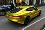
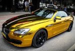
I mentioned this in the other post, but since this thread is about uniform tweaks, my tweak deals with the chrome helmet. Don't really like it, but if they want chrome, do it in a version of gold that is closer to what our team color is (click on the photo to enlarge):
gold chrome.jpg
gold chrome 2.jpg

I'd actually prefer a yellow gold matte metallic (similar to the new maroon helmet):
gold chrome 3.jpg
 

Yes, he can talk about it all he wants. That's who he is. But, if I'm the new basketball coach and my deal is "Burn the Barn down" in reference to how well my teams shoot from three. Are you going to let me put flames all over the Barn and on the new red, yellow, and black fire uniforms? Oh and the new hockey coach wants his own uniform design deal too... seems like an AD decision issue to me?

What color did PJ Fleck introduce that hasn't been a part of Gopher jerseys previously? The last two coaches used anthracite. Metallic gold was used back in the '60's and '90's (possibly other years). The chrome gold is a slight alteration of that, but technology wasn't around then that allowed it, so it couldn't have been used whether or not they wanted to.

If Richard Pitino starts using "Burn the Barn Down" and puts maroon flames on the gold jerseys or the subtle ventilation pattern you see on several teams' jerseys or puts the slogan all over the barn, I highly doubt Coyle would have an issue with it (other than the potential link to arson...). I'm not sure why he should? And I won't be surprised when Coach Lucia is eventually replaced if the next coach has some slogan that gets plastered all over Mariucci. I'm assuming when Coyle signed Fleck's contract he was aware of the fact Fleck had the slogan "Row the Boat" that he was planning on using.

Were you this upset with adding "Brick by Brick" to the previous jerseys? That was Jerry Kill's slogan, not the U of M's. It wasn't used after he left (other than they didn't change the jerseys).

As for my opinion...

I am apparently in the minority that likes the white numbers and trim on the maroon jerseys.

I don't really like the anthracite. Maybe it is because it doesn't have maroon trim, I don't know, I can't put my finger on it. Never loved it, but it seems like the shade is not as nice as previous years?

I'm shocked there isn't a gold jersey, so I'd like to see that.

I have no problem with the metallic gold helmets (I've been expecting them for years), but hope they're used sparingly, like the white or gold helmets previously. Friday night vs. Indiana? At Wisconsin?

I would prefer the giant oar on the helmets to be a stripe made of little oars.

I agree with others that the gold numbers on white jerseys need maroon trim.

A few people have commented they wanted to see players' names. I'm nearly certain they said all uniforms would have the players' names on them, which I like. I thought the "Minnesota" in place of a name on the gold jersey was silly.
 

I mentioned this in the other post, but since this thread is about uniform tweaks, my tweak deals with the chrome helmet. Don't really like it, but if they want chrome, do it in a version of gold that is closer to what our team color is (click on the photo to enlarge):
View attachment 5410
View attachment 5411

I'd actually prefer a yellow gold matte metallic (similar to the new maroon helmet):
View attachment 5412

That gold matte is sick!!! I WANT HELMETS WITH THAT.

On the other hand, I'm wondering if the Chrome gold actually matches better than we think, it may have just been a lighting issue, check this screen capture from the team reveal video:

45fd68ae-df76-4d98-b855-652ca3f8be4d.png


It matches 100x better in this video than from the stills on the Hyprr Elite site or in the original uniform reveal video. You can also see in this shot, as confirmed by someone at the Women's Basketball game, that the Maroon Jersey is the same Maroon we know and love from the Kill-era Uniforms.
 

That gold matte is sick!!! I WANT HELMETS WITH THAT.

On the other hand, I'm wondering if the Chrome gold actually matches better than we think, it may have just been a lighting issue, check this screen capture from the team reveal video:


It matches 100x better in this video than from the stills on the Hyprr Elite site or in the original uniform reveal video. You can also see in this shot, as confirmed by someone at the Women's Basketball game, that the Maroon Jersey is the same Maroon we know and love from the Kill-era Uniforms.

If that is the case, then the video is complete crap.
 

If that is the case, then the video is complete crap.

I don't know if the video was complete crap, more so the lighting and surroundings weren't natural. In the behind the scenes you can see they are on an all white background and being lit from all angles with very bright white lighting. Likely to minimize shadows, but it also made the Maroon seem redder. Because the only surrounding was white, I think the gold chrome had its color get a bit washed out. As we can see in both cases, real life lighting and surrounding paint a different picture.

Kinda like fast food adds.


Top Bottom