Embracing the history of the program

Not true if you consider a helmet to be part of the uniform. Go to The Helmet Project and look at the BCS conference school members. You'll see that around 10 schools meet the criteria and you only get that many if you ignore one off Pro Combat looks like the ones OSU breaks out or minor tweaks to the logos (for example: USC). The group of truly traditional schools uniform wise is actually really small.
Michigan, Ohio State, Penn State, Alabama, Auburn, Georgia, Tennessee, USC, UCLA, Nebraska, Texas, Oklahoma, Wisconsin, Florida, Florida State, Texas A&M, Iowa, LSU.

I guess I can only come up with 18 off the top of my head, but all of those schools have the same uni's now as they did 20 years ago (some with minor changes).
That looks pretty good. I missed a few of those (Auburn jumps out at me) in my super quick skim the last time through The Helmet Project and I think I was thinking the "30 year" end of the mark for most of them (thus I excluded Wisconsin from my first pass).
 

I'm a big fan of the 1960 throwback look as well. Not only is it distinctive and classic, but we know how much kids like white helmets. I think a return to that look would be great, naturally with higher quality jerseys and sewn-on numbers.

According to helmet project, the Gophers abandoned the look after 1967. This means the Gophs were wearing those unis the last time they won a national championship; the last time they won a share of the Big Ten; and the last time they held the jug, the axe, and the pig at the same time.

Maybe the block M isn't meant to be on the helmet.
 

Some of the arguments I'd consider.

- Bierman's Gophers wore the all gold look. One could argue they should wear this because it represents the era of domination of.the game by the U. I thought they looked good against AFA.
- As the OP stated the 1960 look is classic in a PSU / Alabama kind of way. However, as many have pointed out, the reasons PSU & 'Bama still wear them are called Bryant and Paterno. A friend of mine's father played for the 1960 team and I've seen that white helmet in his house - very cool.
- Another argument is to be distinctive & unique (if you are to go with a single look). While Wisconsin has selected a classic look, from a distance, they look a lot like Nebraska. What does this mean for the Gophers? Don't look like USC or Florida State?

My $.02
- The Maroon should be today's maroon. It should look like the dried blood of a wolverine.
- I know I will be in the minority here but I think the the gold should be metallic - not yellow. Most people think of the Wacker uniform when they hear this, but the Helmet doesn't need to be gold, itt can be maroon. My dad gave me a pennant he bought in the 50's and it has an awesome antique gold colored felt.
- I like the idea of making the block M bigger. I think this is the way to put a modern twist into a classic uniform. The shape of the M should not. Hangs but the scale could be a little larger. The scale would be similar to the scale of the Wisconsin W but without the motion or the shadow - more classic.

So, maroon helmet with larger metallic gold logo, maroon jersey with block M on upper left chest, no piping, metallic gold pants, white socks and black shoes. And to make sure it is really classic, take the names off of the jerseys.
 

I like the jerseys we have, especially the ever popular white helmet. I guess I'm in the "Oregon" school of uniform taste though as multiple helmet/jersey colors has grown on me. I think Cal has done a good job taking the nike template and tweaked it to be unique for them, I think we could do the same. Maroon, White, and gold helmets (special gold outs only perhaps) with jerseys and pants to match. Could have a lot of good clean looks such as the maroon helmet, white jersey, maroon pants (which is a lot better of an away getup than the mason era yellow pants). Maybe a gold helmet/jersey with maroon pants?


I like the jerseys we have, especially the ever popular white helmet. I guess I'm in the "Oregon" school of uniform taste though as multiple helmet/jersey colors has grown on me. I think Cal has done a good job taking the nike template and tweaked it to be unique for them, I think we could do the same. Maroon, White, and gold helmets (special gold outs only perhaps) with jerseys and pants to match. Could have a lot of good clean looks such as the maroon helmet, white jersey, maroon pants (which is a lot better of an away getup than the mason era yellow pants). Maybe a gold helmet/jersey with maroon pants?
Agreed. Let's see the jersey that they make for us and see if that design is worth replicating.
 

I agree that the 1960's era uniforms are the best, but I really think we should keep the current maroon helmets. Outside of the Wacker years (which I do not want to repeat in any way), we've worn maroon helmets with a gold "M" since 1977. It's as much of a signature look as we have.

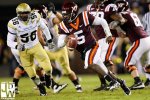
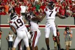
I've said this before, but I really like the look that Virginia Tech has gone with and believe we could replicate it with the 1960's uniforms and the current helmets. A few photos are attached.

VT1.jpgVT2.jpg


Top Bottom